Introduction
PROBLEM
How can first time property buyers receive all the information they need on a real estate listing while keeping them excited and engaged during the process?
GOAL
Create a responsive web app that potential buyers can access at any situation to provide a seamless and engaging experience.
This project was created as a part of CareerFoundry's UI program.
|
ROLE: UX/UI Designer
PROJECT SCALE: 3 Month Project PRIMARY STAKEHOLDER: CareerFoundry UI Course |
TOOLS USED
|
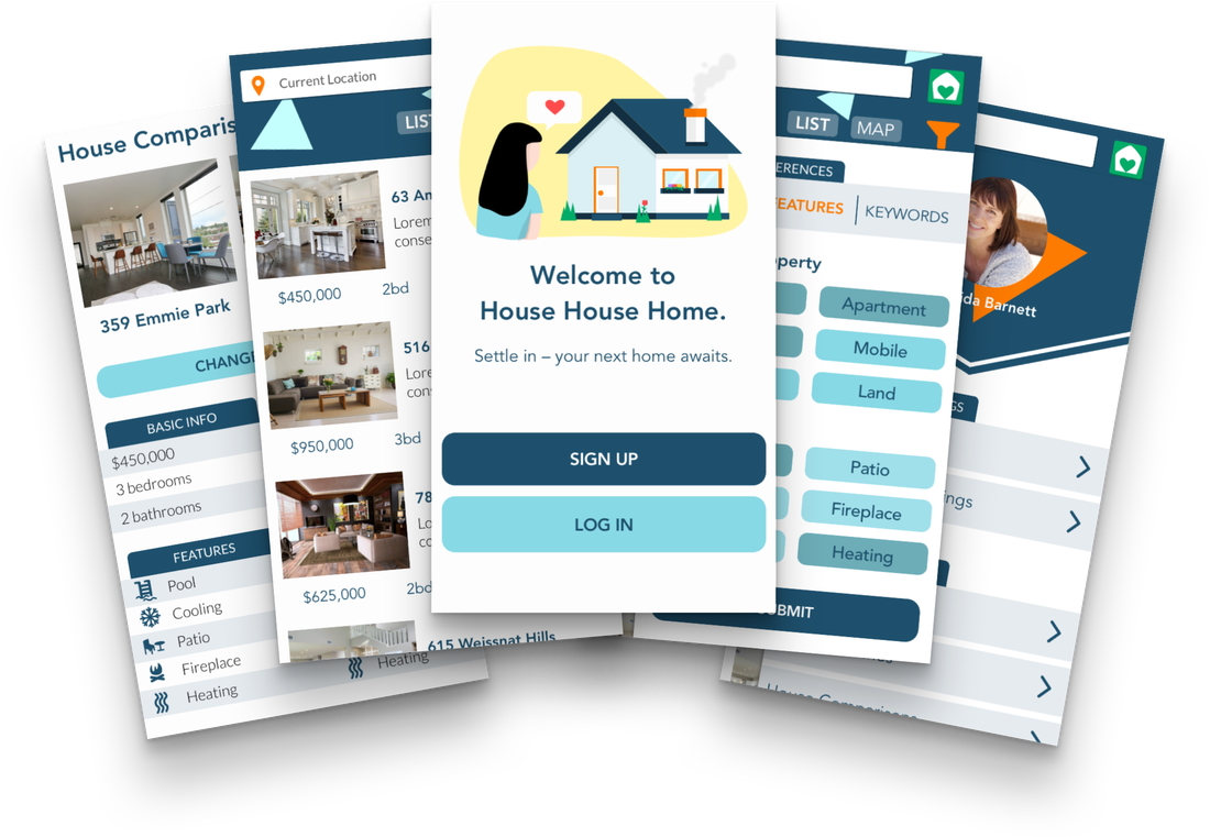
The Makings of House House Home
|
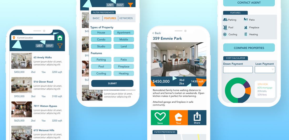
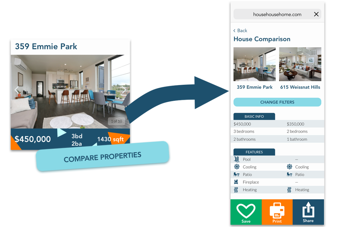
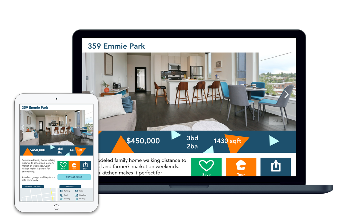
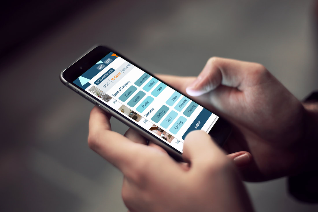
House House Home is designed for the busy, on-the-go professional. It features:
With a side-by-side comparison, users can choose which features they want juxtaposed and brought to their attention. |
|
Logo Design
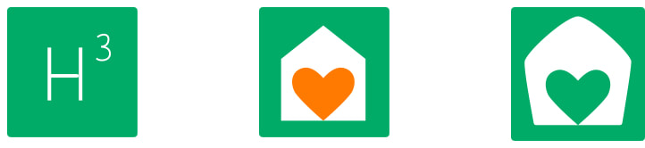
The logo design went through three versions. The first design made use of name's alliteration. But, as it lacked white space, the logo changed to a heart within a house, inspired by the saying “home is where the heart is." This is meant to convey that shopping for a home using House House Home would be a friendly and trustworthy experience.
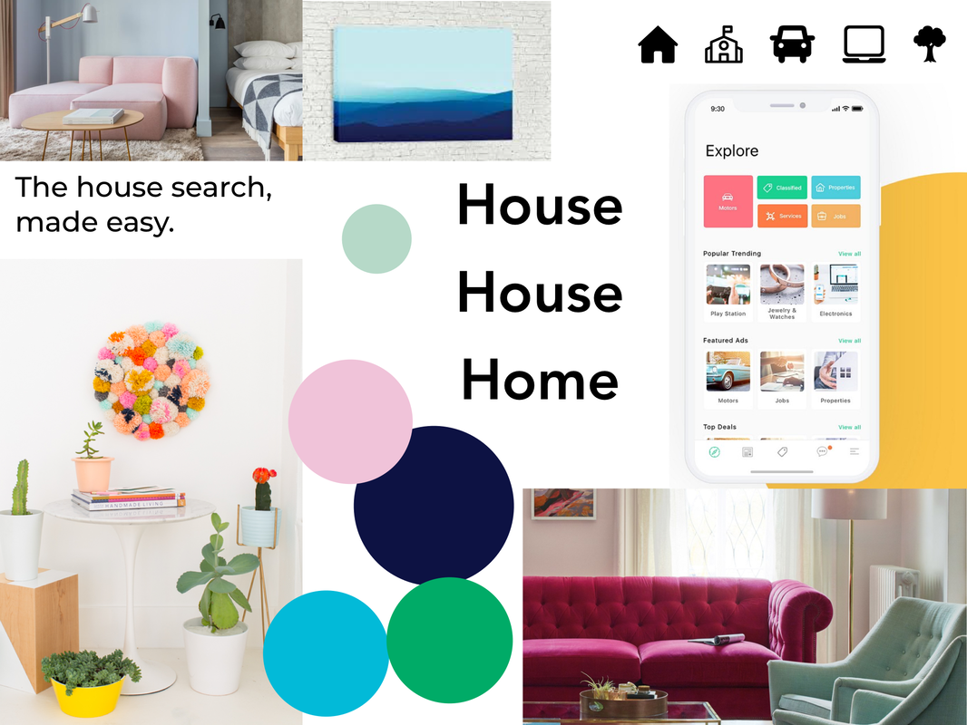
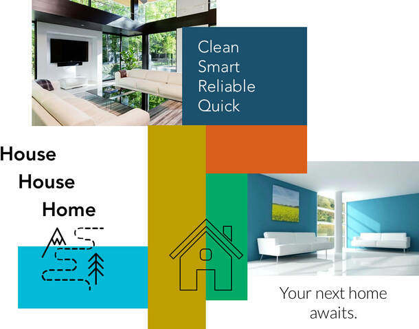
Moodboards for Visual Direction
|
|
I created two visual directions based on rough branding guidelines that required the web app to be "clean, quick, smart" with "greens or blues."
The first version was more floral and could appeal to a modern feminine aesthetic. The moodboard on the right is similar in that it's modern and clean, but the color scheme focuses more on blues with a deeper green, which plays down the whimsicality. Though the first one speaks more to my personal color palette, I went with the second one, which aligns better with what our demographic would prefer.
The first version was more floral and could appeal to a modern feminine aesthetic. The moodboard on the right is similar in that it's modern and clean, but the color scheme focuses more on blues with a deeper green, which plays down the whimsicality. Though the first one speaks more to my personal color palette, I went with the second one, which aligns better with what our demographic would prefer.
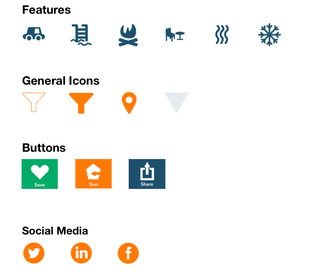
Custom Icons and Branding
|
Custom icons and illustrations further add to the personality of House House Home. You can check out the style guidelines here. |
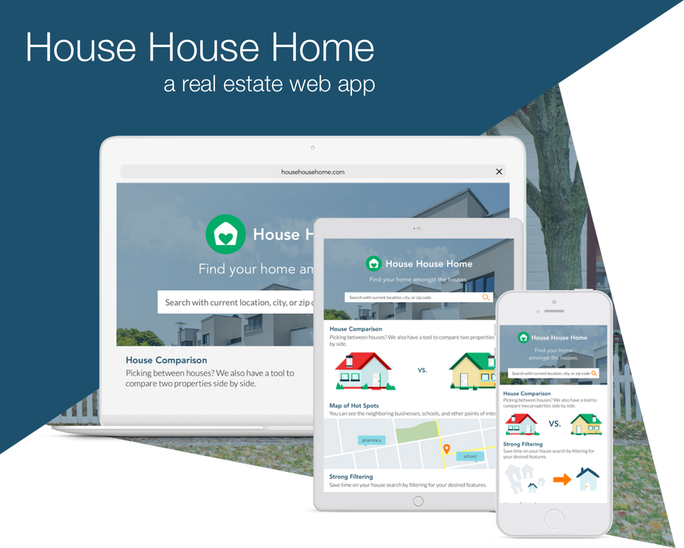
Responsive Design
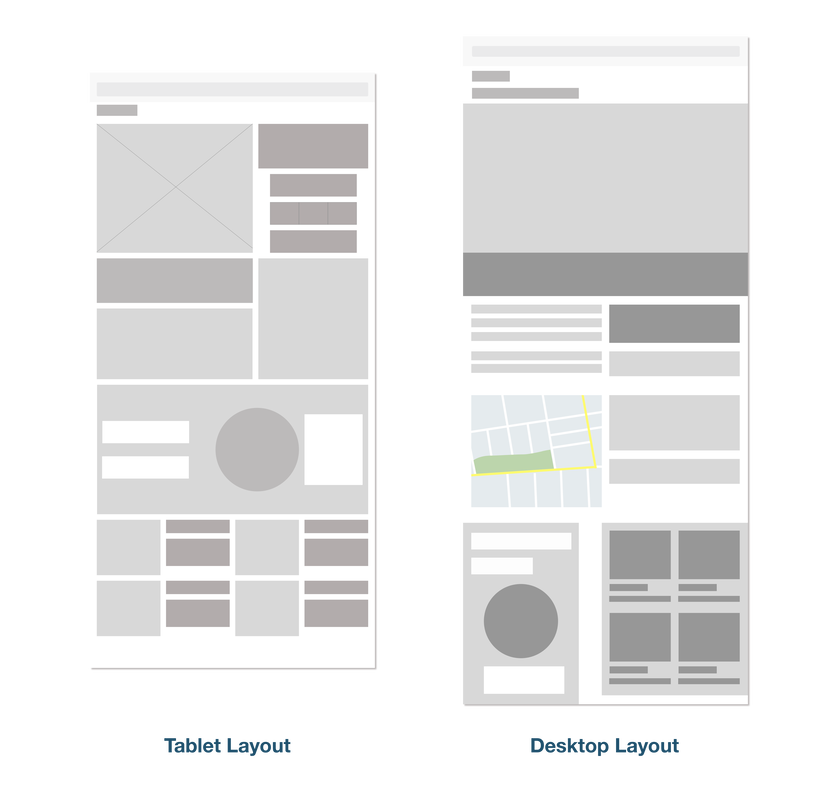
|
I faced some issue translating the mobile wireframes into tablet and desktop because of the way I originally had it laid out, especially for the home screen. (I didn't originally consider designing for responsiveness when I was first sketching out the design.) To get to the root of the problem, I re-designed my mobile wireframes so that they were more responsive-friendly. |
Retrospective
My original intention was to design a tool that was fun and delightful to use without distracting the targeted demographic of busy professionals who want information delivered to them in an at-a-glance manner. My biggest challenge was to differentiate this web app from the other real estate tools, such as Zillow and Redfin. I wanted to guide the project in a direction where I would be able to inject personality into it and push my creativity.
|
As a result, I am quite proud of the web app's quirky look and feel, which was inspired its name. I chose "House House Home" as the title to convey reliability and trust so users could feel confident that they will find their future abode in an "aha!" moment while using the web app. Moving forward, I'd like to approach more projects with a visual brainstorm and ideate on what type of personality I'd like to give a design. A fun question to ask is, if this design were a person, what would they look like? Would the user be friends with them? In the case of House House Home, I do think our persona and demographic would befriend them. |
What kind of person do you think this web app would be? Feel free share your thoughts, and hear more about the project!