UX Writing Challenge
In April, I started a 15-day UX Writing Challenge to build my writing skills. The copy for headline, body, and buttons each day had character limits, so working around these constraints was quite a fun activity that pushed me to evaluate what is of value and how to better phrase messages, especially in the context of the given scenario.
The UX Writing Challenge also turned out to be an exercise for me to try different UI styles as well. Hope you enjoy!
The UX Writing Challenge also turned out to be an exercise for me to try different UI styles as well. Hope you enjoy!
|
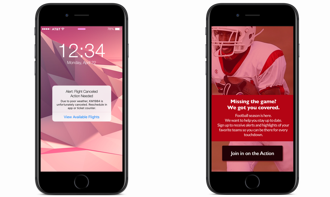
Day 1
Scenario: A traveler is in an airport waiting for the last leg of a flight home when their flight gets abruptly canceled due to bad weather.
Challenge: Write a message from the airline app notifying them of the cancellation and what they need to do next. |
Day 2
Scenario: A user is a working parent, and a big sports fan, in the midst of their favorite sports season who can no longer attend games.
Challenge: Write a promotional screen for an app that lets users choose teams, sends game reminders, real-time score updates and highlight videos. |
|
Day 3
|
Day 4
|
|
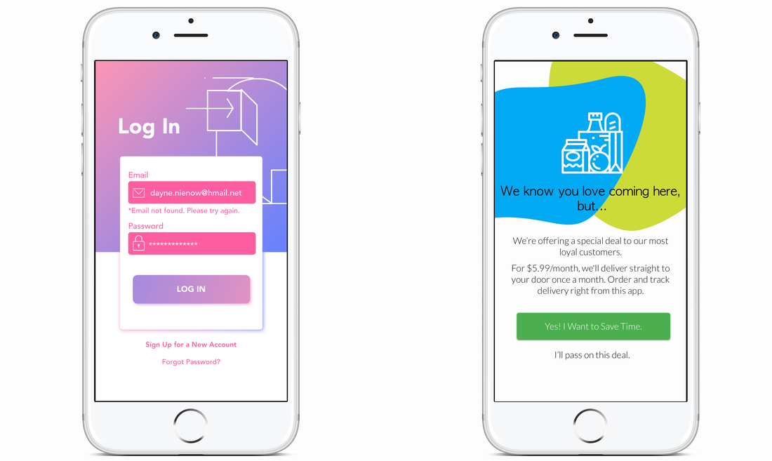
Scenario: The user entered the wrong email address to sign in to their account.
Challenge: Tell the user to enter the right email. |
Scenario: A user is in their favorite supermarket. They open the supermarket’s app on their phone to see what’s on sale and are greeted by a promotion.
Challenge: Write a promotional home screen for a subscription service that delivers groceries to the user once-a-month for a flat fee. |
|
Day 5
|
Day 6
|
|
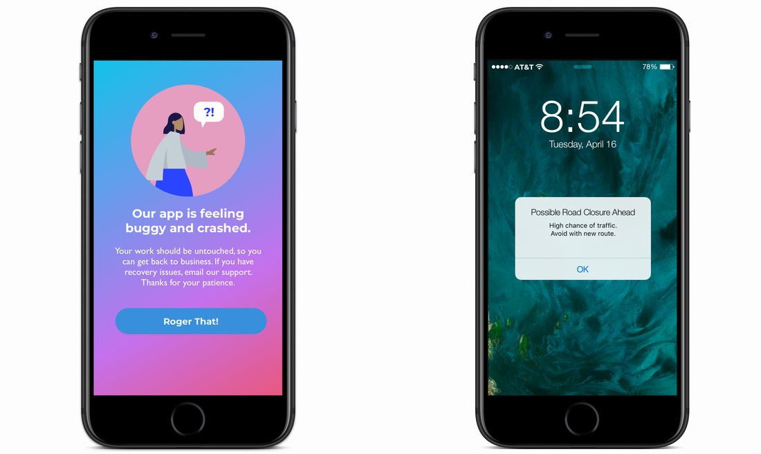
Scenario: The user works in graphic design. While critiquing a design in a mobile app, their phone abruptly turns off. When they restart the phone, they reopen the app.
Challenge: Write a message that the user will read immediately upon opening the app. What do they need to know? What steps (if any) do they need to take to recover their content? What if they can't recover the content? |
Scenario: It’s Monday. A user has just gotten into their car to drive to work. They plug their phone into the car and start driving.
Challenge: How would you let the user know there’s a fire happening in a nearby town that is causing road closures? The effect on their commute is unknown, but there is a definite danger if the fire gets closer. How do you communicate this to them? When? Write it. |
|
Day 7
|
Day 8
|
|
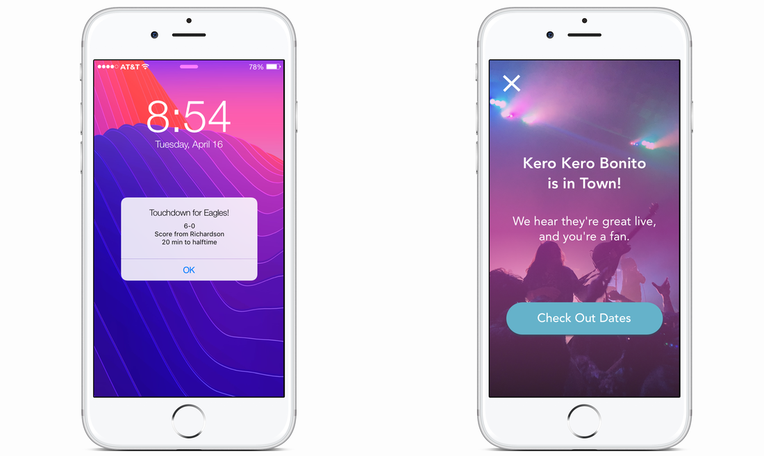
Scenario: A sports fan is at a wedding while his team is playing their arch-rivals. His team makes a touchdown.
Challenge: How would you, quickly, let the sports fan know about the latest play, the current score, and the key players? Write it. |
Scenario: The user is a casual music fan and (on occasion) goes to live concerts. They have a music player app on their phone.
Challenge: Tell the user that one of their favorite bands is playing live in their town. How would you compel them to want to go? |
|
Day 9
|
Day 10
|
|
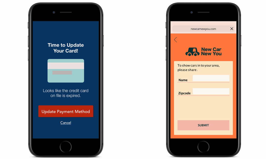
Scenario: The user is trying to rent a car using an application but the credit card they have on file has expired.
Challenge: Write them an error message so that they can correct the problem, and try not to be a jerk about it. |
Scenario: The user is trying to view a website to help them buy a car. But, the content can’t load without the user’s location. They need to enter their ZIP code and first name.
Challenge: Ask them where they live and who they are without sounding like you're unnecessarily mining their data. |
|
Day 11
|
Day 12
|
|
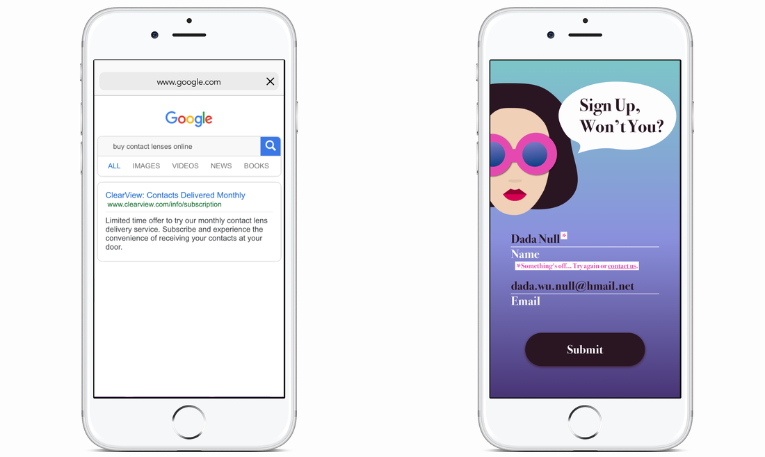
Scenario: An elderly user is doing a Google search to find an easy way to buy contact lenses online.
Challenge: Write a title and meta description for a website that sells subscription contact lenses delivered to a user every 30 days—convince them to try it. |
Scenario: A user is creating an account. When they come to the step where they are asked to enter their name, they get an error message. A fraud detection software thinks their name is fake—but it’s wrong 5% of the time.
Challenge: Write an error message that prompts them to fix the error without shaming them for having a fake-sounding name. |
|
Day 13
|
Day 14
|
|
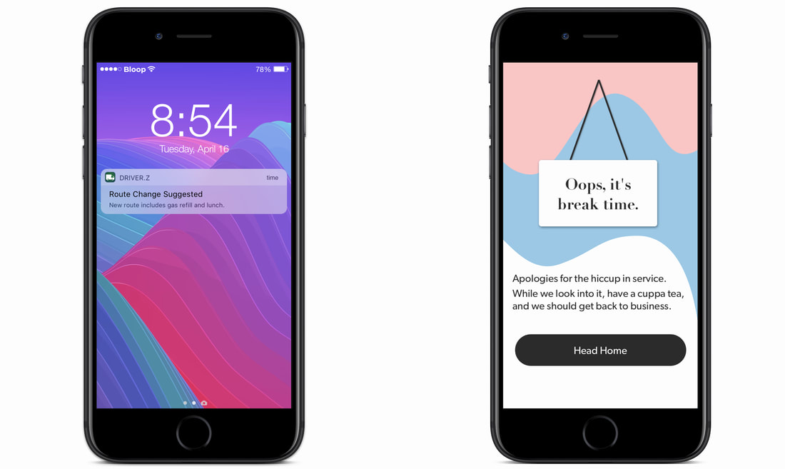
Scenario: A short-haul truck driver has a phone app that monitors his route, schedule, fuel & deliveries. He has 6 more deliveries before stopping for fuel and lunch. Due to unexpected traffic, he’s behind schedule. He can choose to stay on his planned route for a few more stops, but risk running low on fuel and missing lunch, or he can get fuel and lunch now and finish the deliveries later.
Challenge: Write a push notification alerting him of this dilemma and options. |
Scenario: a user is shopping using a price comparison app that boasts “REAL-TIME” pricing on items. As they are checking the price of an item, something goes wrong. The problem is unknown.
Challenge: write a message that informs the user that they cannot access the app right now. You cannot specify "why" the app doesn't work, you also want them to continue using the app. |
Day 15
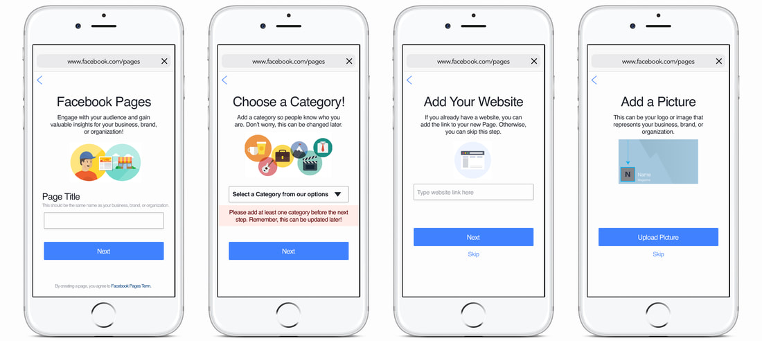
Challenge 1: Using the browser on your mobile device, please go to Facebook and log in. Tap the menu icon and then tap Create New Page in the Pages section.
Your task: Rewrite the page creation and user onboarding experience. Be bold and take risks.
The way Facebook introduces Pages has an extra screen before you can get to filling out information. With the UX redesign, I introduce this step sooner so users may feel more inclined to start. I also omitted some of the text that was meant to give users suggestions on how to complete a step. I don’t know if their extra directions add value, and could even be more confusing. I also found its error messaging impersonal, such as “You’re required to add at least one category for your Pages.” I definitely think this can be made friendlier, which I addressed in the second screen above. I also moved Skip from the upper righthand corner to the bottom under Next, as these are both buttons that drive the user forward.
