PROBLEM
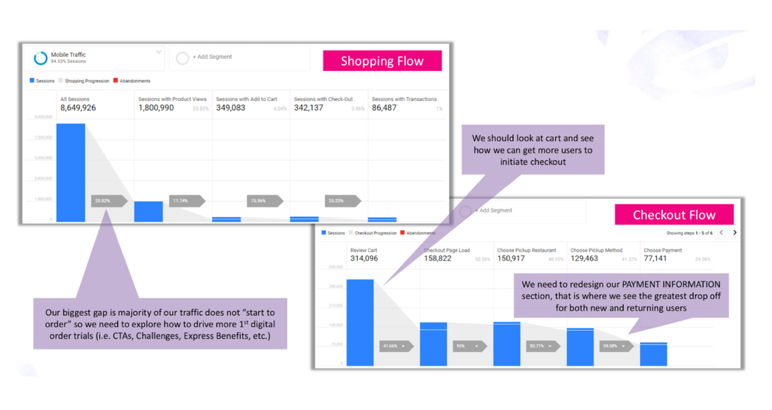
Taco Bell's website sees the greatest drop off of users at the payment step during the checkout process. How can we redesign the checkout experience to get more new and returning users to initiate checkout?
GOAL
Deliver a frictionless checkout experience that allows the customer to seamlessly move through the checkout process in stages, with a clear understanding of what’s being asked of the customer at every step. We should see an increase in conversion as a result of the new checkout experience, with a specific focus on improving the payment section and reducing the number of validation calls being made to Hybris.
|
ROLE: UX/UI Designer, copywriter
PROJECT SCALE: 3 Month Project PRIMARY STAKEHOLDER: Taco Bell eCommerce and Digital teams |
TOOLS USED
|
AREAS OF FOCUS
|
Step-by-Step Checkout
Reimagine how to separate the checkout process in multiple steps to reduce the number of validation calls. |
Cart Update
Look at the current cart to see how to get more users to initiate the checkout process. |
Payment
The current Payment section has the greatest drop off for both new and returning users. |
OUR PROCESS
|
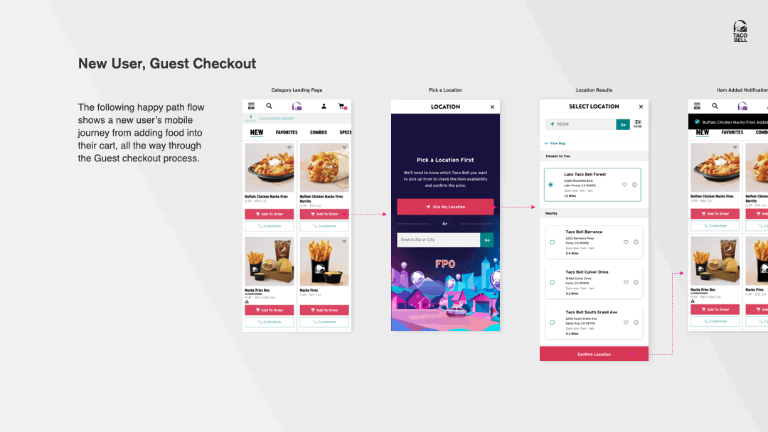
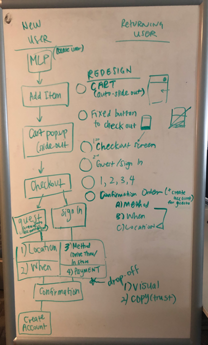
Before we started with visual layout, we wanted to make sure that we accounted for the (at least) four types of paths users can take depending on the type of order and the type of user they are:
Once users want to checkout, we separated the flow into four different steps:
Many websites see drop-off of users during payment because there is a lack of trust, so I wanted to emphasize the importance of establishing trust during this step with both the visuals and copy. |
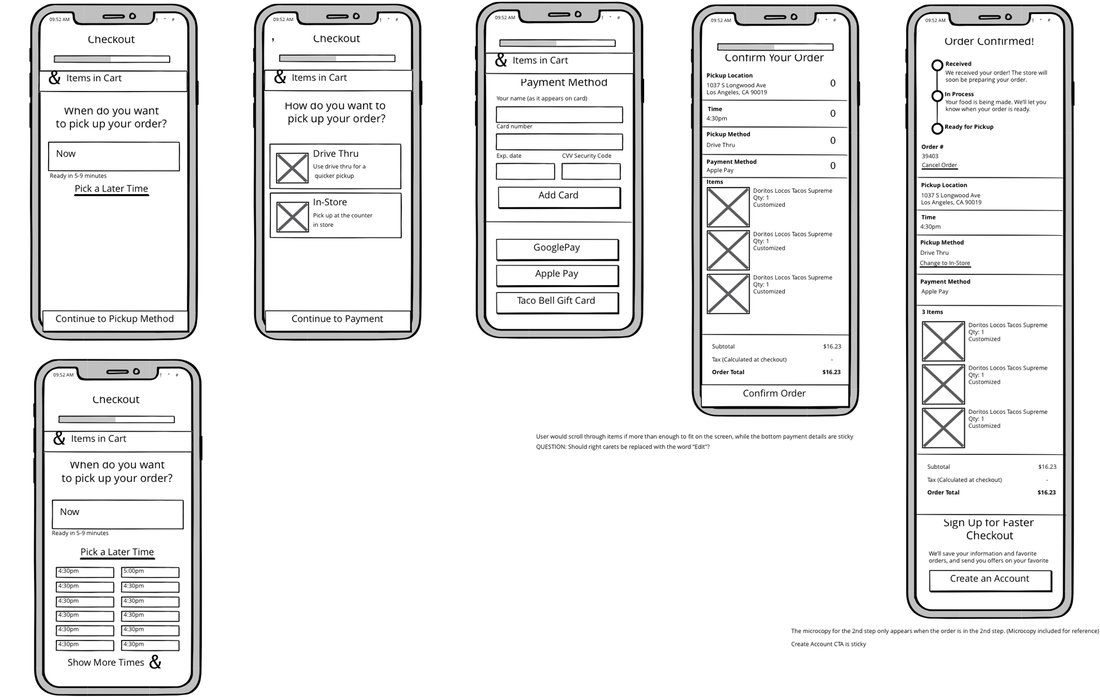
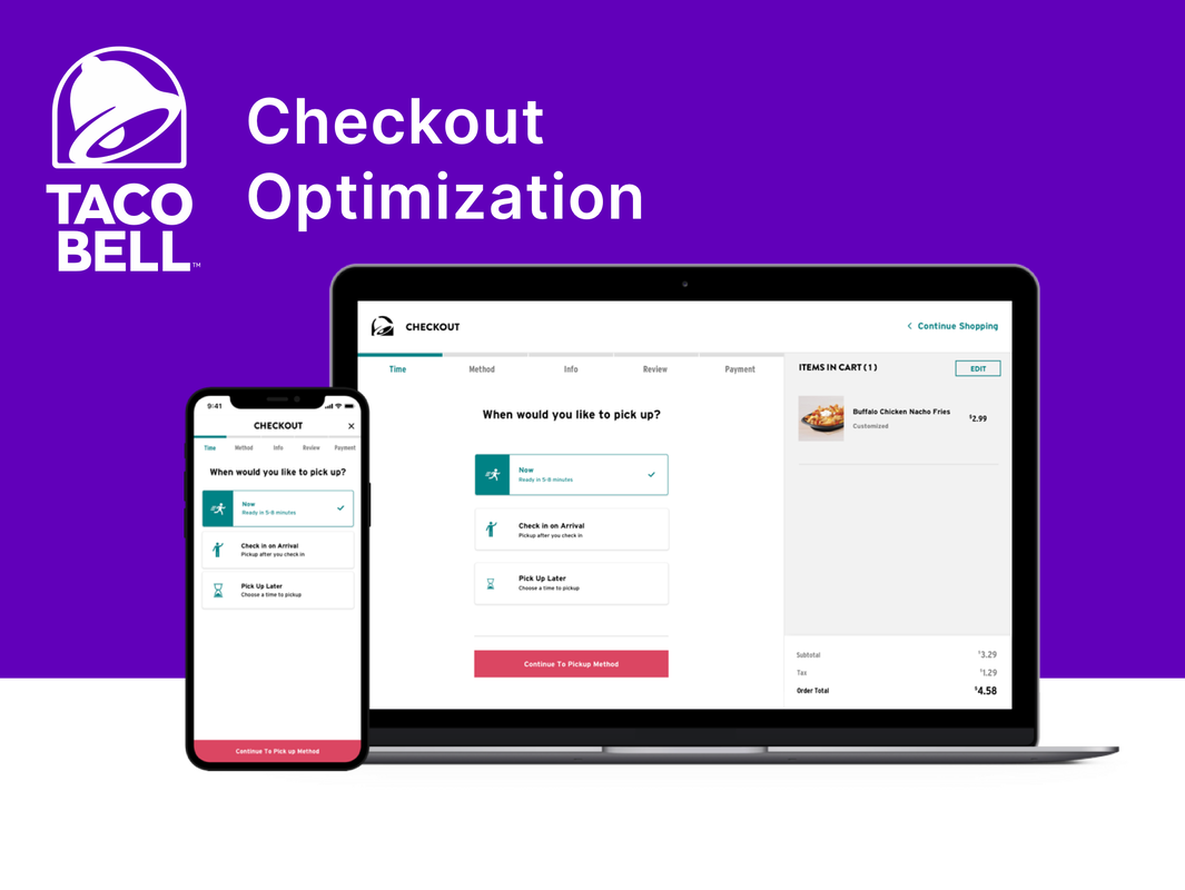
The process to checkout is on one screen on the current website, which makes for a confusing and uninteresting experience. This was our first iteration of what the broken up checkout flow would look like. We wanted to add a progress tracker at the top as a visual cue for the user to see how far along they are in the checkout to motivate them to complete their order.
DELIVERY
In addition to user flow changes, we updated the existing color scheme to increase color contrast to meet WCAG accessibility standards. Due to the deadline of the project, there was no time for user testing. Otherwise, I would have liked to ask users to go through various scenarios, such as changing their store location and reviewing their order. Because of COVID-19, the checkout optimization project is on hiatus.